|
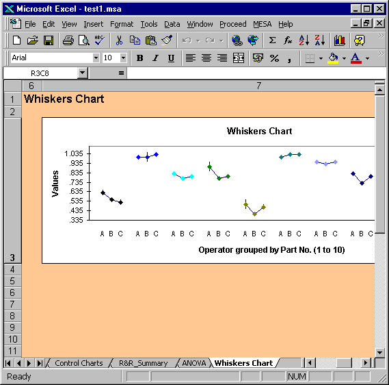
Whiskers Chart
In the Whiskers Chart the values are grouped by part number, e.g. all of the
readings for part number 1 are plotted together in the first group.
The plot actually consists of the average value for each operator, with
the high and low values signified by the upper and lower whiskers.
In the above example (obtained using the AIAG data set)
the relatively small variation for individual operators for a particular part
is shown by the small extent of the whiskers.
The coloured data points signify the average of the values obtained by
each operator for each part.
The Whisker Chart is useful for assessing:
·
consistency between operators
·
existence of outliers
·
operator-part interactions
|