|
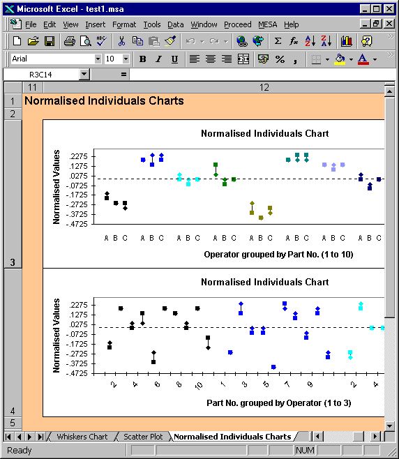
In the upper plot the normalised values have been
grouped by part number, e.g. all of the readings for part
number 1 are plotted together in the first group.
Each group therefore shows how the normalised
values vary with operator, with the part number held
constant. For
example, the above plot indicates that the variation from
part-to-part is greater than from operator to operator.
The second format groups the
normalised values by operator, e.g. all of the readings
for operator 1 (A) are plotted together in the first
group. Each
group therefore shows how the normalised values vary with
part number, with the operator held constant.
Consistent with the first plot, this one indicates
that there is no significant operator-to-operator
variation. This
agrees with the effect plot for inconsistency.
The Normalised Individuals Chart can
help in assessing:
·
Reproducibility
·
Consistency between operators
·
Existence of outliers
·
Operator-Part interactions
|