|
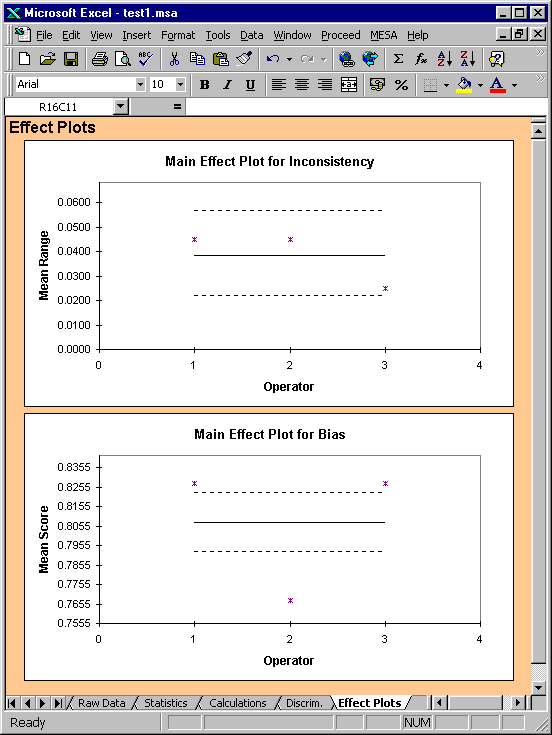
Effect Plots
Two Effect Plots which are described by Wheeler & Lyday are
generated by Mesa: (i) the Main Effect Plot for Inconsistency and
(ii) the Main Effect Plot for Bias.
The upper plot (obtained using the AIAG data) is basically
an Analysis of Mean Ranges (ANOMR) plot, a method which has also
been described by Ullman. The
decision limits shown are the 5% limits shown on the Calculations
sheet for operator ranges (0.021965,
0.056963). There are no
points outside the limits and this indicates that there are no
significant differences in the variation of each operators
measurements.
|